Brand Guide
Brand Guidelines
The Tin Cup Challenge is one of the most innovative charitable fundraisers in the nation. These brand guidelines ensure consistent representation of our community-focused mission.
$30.8M
Raised Since 2008
64
Local Nonprofits
228
Challengers in 2025
1,623
Donors in 2025
Brand Colors
Our color palette reflects the vibrant community spirit of Teton Valley and the energy of the Tin Cup Challenge event.
Primary Dark Colors
Burgundy
#851a2c
RGB(133, 26, 44)
Accent color - emphasis, calls-to-actionNavy
#192a3d
RGB(25, 42, 61)
Footers, dark backgroundsBlue
#005282
RGB(0, 82, 130)
Primary brand color - buttons, headers, accentsSecondary Lighter Colors
Gold
#febe58
RGB(254, 190, 88)
Highlights, warm accentsPurple
#5a2a5c
RGB(90, 42, 92)
Hover states, depth, shadowsTeal
#5E847F
RGB(94, 132, 127)
Supporting accent, natural tonesCoral
#E07A5F
RGB(224, 122, 95)
Category badges, accentsWarm Cream
#f9f6f1
RGB(249, 246, 241)
Section backgrounds, cards, stat boxesSection Design
Our homepage uses curved section transitions and overlapping layouts to create visual depth and flow between content areas.
Curved Section Borders
Sections use curved bottom corners to create smooth visual transitions between content areas.
border-radius: 0 0 60px 60px;
Applied to: Stats section, About/Nonprofit section
Overlapping Sections
Sections overlap to reveal the curved corners against contrasting backgrounds.
Uses: negative margins (-60px) and padding-top (180px)
CSS Pattern Reference
/* Curved section with overlap */
.section-with-curve {
    border-radius: 0 0 60px 60px;
    position: relative;
    z-index: 2;
    margin-bottom: -60px;  /* Creates overlap */
}

/* Following section accommodates overlap */
.following-section {
    padding-top: 180px;  /* Extra space for curved section */
}Font Families
Display Font
Manrope
Bold 700
Semibold 600
Medium 500
Regular 400
Used for: Headlines, titles, hero textBody Font
Oswald
Bold 700
Semibold 600
Regular 400
Light 300
Used for: Body text, paragraphs, descriptionsAccent Font
Caveat
Bold 700
Semibold 600
Medium 500
Regular 400
Used for: Handwritten feel, special calloutsHeading Hierarchy
Proper heading hierarchy ensures semantic structure, accessibility, and visual consistency across the site.
Homepage Heading Structure
H1 - Primary Page Title (One per page)
Give Local.
Give Together.
Give Bigger.
Hero section - the main title for the page
H2 - Section Titles
- Give Now - CTA banner section
- Supporting 64 Local Nonprofits - About section
- Join Us on Event Day - Events section
- Community Energy - Photo gallery section
- Powered by Challengers - Sponsor logos section
Major section headings - typically use .section-title__title class
H3 - Sub-section Titles
- Tin Cup Challenge Annual Campaign Fund Totals - Stats section
- Challenge Participants - Stats section
- Tin Cup Challenge Event Day 2026 - Event card
- Are You a Nonprofit? - CTA banner
Sub-headings within sections - smaller than H2
Eyebrow Text (Not a heading)
Community Foundation of Teton Valley
Taglines above section titles - use .section-title__tagline class (span, not heading)
Heading Sizes
| H1 (Hero) | 72px / 60px / 42px |
| H2 (Section) | 50px / 42px / 32px |
| H3 (Sub-section) | 36px / 32px / 28px |
| Eyebrow | 16px |
Sizes shown: Desktop / Tablet / Mobile
Heading Hierarchy DO's
- Use only one H1 per page
- Maintain sequential order (H1 → H2 → H3)
- Use headings for structure, not styling
- Keep letter-spacing normal (no tight kerning)
- Use Oswald for display headings
Heading Hierarchy DON'Ts
- Don't skip heading levels (H1 → H3)
- Don't use multiple H1s on a page
- Don't use headings just for visual size
- Don't apply tight letter-spacing (-0.04em)
Brand Voice & Messaging
Core Messaging
Tagline
"Inspiring Philanthropy"
Key Messages
- "Community Counts"
- "Accept the Challenge"
- "One in three households in Teton Valley give through the Tin Cup Challenge"
- "One of the most innovative charitable fundraisers in the nation"
Mission Statement
"The Community Foundation of Teton Valley works to elevate lives through the power of generosity by championing the nonprofit sector, empowering donors, promoting a culture of giving, and serving as a catalyst in addressing critical community needs."
Tone & Voice
Welcoming & Inclusive
Use phrases like "Join us," "Everyone is invited," "Be part of our community"
Energetic & Celebratory
Emphasize the joy of giving, community celebration, and the festival atmosphere of Event Day
Community-Focused
Highlight local impact, Teton Valley pride, and collective achievement
Action-Oriented
Use active language: "Run with us," "Support," "Challenge," "Participate," "Celebrate"
Inspiring & Uplifting
Share impact stories, celebrate donors and volunteers, emphasize the power of collective giving
Photography Guidelines
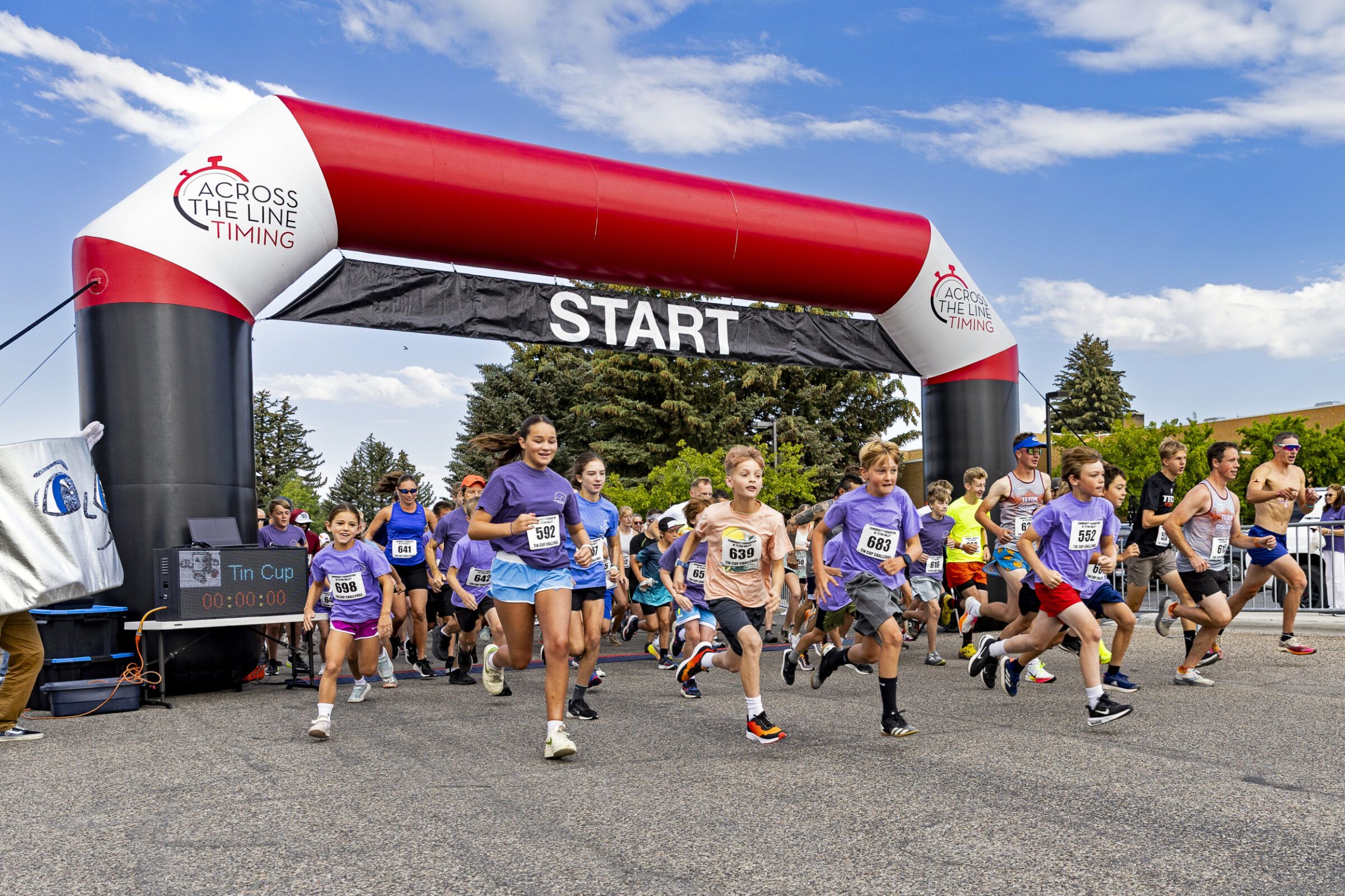
Action & Energy
Capture the dynamic energy of Event Day - runners at the start, community in motion, active participation
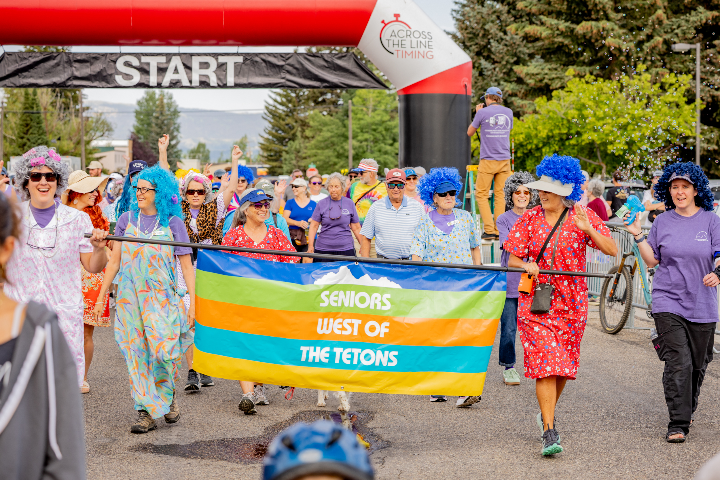
Community Spirit
Showcase creative nonprofit participation, colorful costumes, community celebration, and the joy of giving
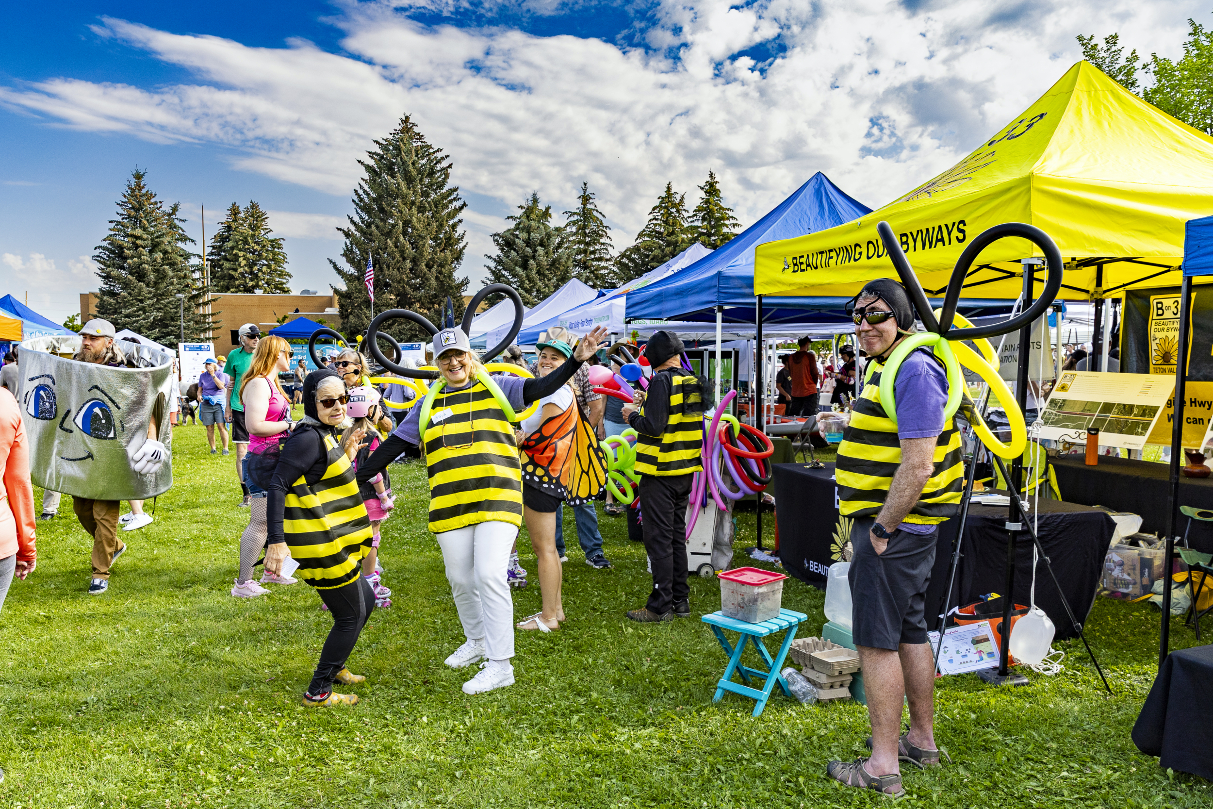
Festival Atmosphere
Highlight the outdoor setting, bright tents, community interaction, and the welcoming environment
Photography Style DO's
- Use bright, outdoor natural lighting
- Capture blue skies and mountain backdrops (Teton Valley setting)
- Show diverse ages and community members
- Include action shots and candid moments
- Highlight colorful elements (tents, costumes, race bibs)
- Focus on genuine smiles and community connection
- Show the festival/celebration atmosphere
Photography Style DON'Ts
- Avoid dark, indoor, or moody lighting
- Don't use overly staged or formal poses
- Avoid images that feel corporate or sterile
- Don't crop out the natural Teton Valley setting
- Avoid images showing only individuals (emphasize community)
- Don't use stock photography
- Avoid images that don't reflect local Idaho character
Logo Usage
Primary Logo
Community Foundation of Teton Valley / Tin Cup Challenge logo
Path: assets/images/website/graphics/community-foundation-of-teton-valley_tincup_logo.svg18th Annual Tin Cup Logo (White)
For use on dark backgrounds
Path: assets/images/tin-cup/tin-cup-logos/cftv-18th-tin-cup-challenge-stacked-white.svgLogo DO's
- Maintain proper clear space around logo
- Use official logo files (vector SVG format preferred)
- Ensure logo is legible at all sizes
- Use white version on dark backgrounds
- Maintain original proportions
Logo DON'Ts
- Don't stretch or distort the logo
- Don't change logo colors
- Don't add effects (drop shadows, glows, etc.)
- Don't place on busy backgrounds
- Don't recreate or modify the logo
Event Day Branding
START Arch
Red & white inflatable arch - iconic race start marker
Bright Red: #E23F5C
Race Bibs
Blue numbered bibs for timed runners - signature element
Blue: #005282
Tent Canopies
Bright blue tents and purple accents create vibrant festival atmosphere
Blue: #005282
Key Event Elements
- Date: 3rd Saturday in July (July 18, 2026)
- Time: 9:00 AM - Noon
- Location: Driggs City Park, Driggs, ID
- Activities: 5K, 10K, Fun Run/Walk, Diaper Derby
- Spirit Awards: Nonprofits dress in "spirit of giving"
- Nonprofit Booths: Community engagement tables
- Awards Ceremony: Dawn Banks Leadership Award
- Atmosphere: Festival, celebration, community
Stats Display
Statistics are displayed in warm cream boxes with blue numbers for high visibility and brand consistency.
Stat Box Style
Background: #f9f6f1 (Warm Cream)
Number Color: #005282 (Blue)
Number Size: 42px, Weight 800
Label Color: #192a3d (Navy)
Label Style: 14px, Uppercase, Weight 600
Border Radius: 12px
Padding: 14px 40px
Number Animation Tips
Do
- Use
font-variant-numeric: tabular-numsfor stable widths - Center numbers within fixed-width containers
- Use Intersection Observer to trigger on scroll
- Keep animation duration under 2 seconds
Don't
- Allow boxes to resize during animation
- Use proportional fonts for numbers
- Animate numbers that aren't in viewport
Category Badges & Tags
Color-coded category badges and tags for nonprofit filtering and organization.
Filter Button Colors
Gold - #febe58
Burgundy - #851a2c
Coral - #E07A5F
Navy - #192a3d
Teal - #5E847F
Blue - #005282
Purple - #5a2a5c
Orange - #E67E22
Do
- Use consistent colors for each category
- Maintain 25px border-radius for filter buttons
- Use white text on dark backgrounds, navy text on light backgrounds
- Apply same colors to card category tags
Don't
- Mix category colors or use different colors for same category
- Use colors that don't meet contrast requirements
- Change border-radius or padding inconsistently
- Use category colors for non-category elements
CSS Variables Reference
/* Primary Brand Colors */
--cftv-blue: #005282;          /* Primary - buttons, headers, accents */
--cftv-navy: #192a3d;          /* Footers, dark backgrounds */
--cftv-burgundy: #851a2c;      /* Accent color, emphasis */
--cftv-gold: #febe58;          /* Highlights, warm accents */

/* Section Backgrounds */
--cftv-cream: #f9f6f1;         /* Warm cream - section backgrounds, stat boxes */

/* Category Filter Button Colors */
--cftv-burgundy: #851a2c;      /* Animal Rescue */
--cftv-coral: #E07A5F;         /* Arts & Culture */
--cftv-navy: #192a3d;          /* Civic & Service */
--cftv-teal: #5E847F;          /* Conservation & Environment */
--cftv-blue: #005282;          /* Education */
--cftv-purple-light: #5a2a5c;  /* Health & Human Services */
--cftv-orange: #E67E22; /* Sports & Recreation */Animations & Interactions
Subtle animations enhance the user experience and draw attention to interactive elements.
Slide-In Animations
Buttons and CTAs slide in from the right on scroll to draw attention.
@keyframes slideInFromRight {
  0% {
    opacity: 0;
    transform: translateX(50px);
  }
  100% {
    opacity: 1;
    transform: translateX(0);
  }
}
Number Scramble
Stats animate with counting effect using Intersection Observer for scroll triggers.
/* Stable number widths */
.stat-number {
  font-variant-numeric:
    tabular-nums;
  text-align: center;
  width: 100%;
}
Hover Effects
Cards and buttons lift on hover with subtle shadow changes.
.card:hover {
  transform:
    translateY(-5px);
  box-shadow:
    0 8px 25px
    rgba(0,0,0,0.15);
}
Manual Carousel Navigation
Image carousels use manual navigation with arrow buttons for user control.
Shows 5 images with navigation arrows
Logo Carousel
Sponsor logos displayed in auto-scrolling carousel with infinite loop.
Full-width, edge-to-edge layout
Button Styles
Five standardized button styles with consistent hover effects. All buttons lift 2px on hover with a subtle shadow—no circle swipe animations.
Navy Button → Blue Hover
Default: #1a2838 (Navy) / White text
Hover: #005282 (Blue) / White text
Effect: Lifts 2px with shadow
Use: Primary actions, donation buttons
Navy Button → Gold Hover
Default: #1a2838 (Navy) / White text
Hover: #febe58 (Gold) / Navy text
Effect: Lifts 2px with shadow
Use: Event registration, secondary CTAs
Burgundy Button → Blue Hover
Default: #851a2c (Burgundy) / White text
Hover: #005282 (Blue) / White text
Effect: Lifts 2px with shadow
Use: Nonprofit discovery, browse actions
Gold Button → White Hover
Default: #febe58 (Gold) / Navy text
Hover: #ffffff (White) / Navy text
Effect: Lifts 2px with shadow
Use: CTA banners, informational links
Gold Button → Navy Hover
Default: #febe58 (Gold) / Navy text
Hover: #1a2838 (Navy) / White text
Effect: Lifts 2px with shadow
Use: Challenger CTAs, high-impact actions
Button Standards
- Font Size: 14px (16px for larger CTAs)
- Font Weight: 800 (Bold)
- Padding: 15px 45px (consistent across all)
- Border Radius: 18px
- Text Transform: Uppercase
- Hover Effect: Lift 2px + subtle shadow
- Transition: 0.3s ease
- No circle swipe: Use lift effect only
Need Brand Assets or Have Questions?
Contact the Community Foundation of Teton Valley for official logos, photos, or brand guidance.